Designed data-driven solutions to connect students with health information.
Point of Care
Strengthening student engagement with Tufts health communication.
Role
Timeline
Research & Design Lead, Client Liaison
September 2025 - December 2025
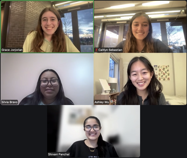
Team
Skills
Mixed methods UX research, usability testing, client partnership, marketing strategy
2 Designers
3 UX Researchers
Tools
Figma
Google Forms
Canva
Summary
Dr. Michael Jordan of Tufts Health Services commissioned our team of 5 to research and improve student engagement with Tufts health communication material, with a specific focus on the vaccine clinics running during our project timeline. We researched and designed several improvements to Tufts’ communication strategy, slated for implementation in the 2026 vaccination clinic campaign.
I am proud of our thorough research, user-centered decision-making, and user-validated design improvements. Through this project I learned to balance client and user needs, conduct insightful usability tests, and pitch new ideas to executives.
Problem Framing
Students aren’t engaging with campus-wide communication.
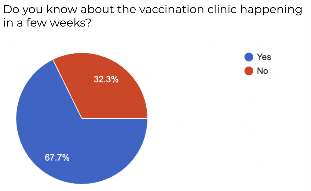
Only half of recipients were opening Dr. Jordan’s emails about free Tufts vaccination clinics.
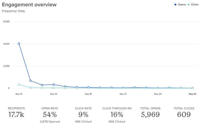
One third of students didn’t read the email about the upcoming vaccination clinics.
Exploration and Learning
How might we make more students aware of Tufts' health services?
Our initial hypothesis was to redesign Tufts' emails and mobile app. Before designing, we researched.
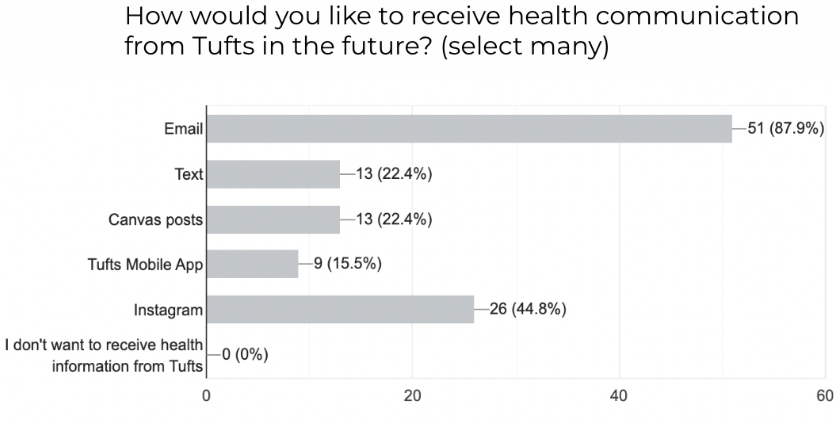
We designed a Google Forms questionnaire with Likert scales and qualitative input. With 60+ responses, we learned that, for Tufts undergrad students,
Email is preferred by the vast majority (88%)
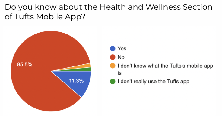
Only 11.3% of students know about Tufts' mobile app
Canvas posts are somewhat preferred
We also conducted user interviews with students and healthcare professionals, as well as sent a survey to Tufts' communication team. We learned that
Emails will get buried if not immediately eye-catching

We should diversify digital & physical media

Students’ first instinct is to check the Tufts Health Services website

⊹ Data-Driven Project Pivot
Our original plan was to redesign the Tufts mobile app. But since very few students used the app, we set our focus on channels with a wider audience.
Ideation
Design Direction
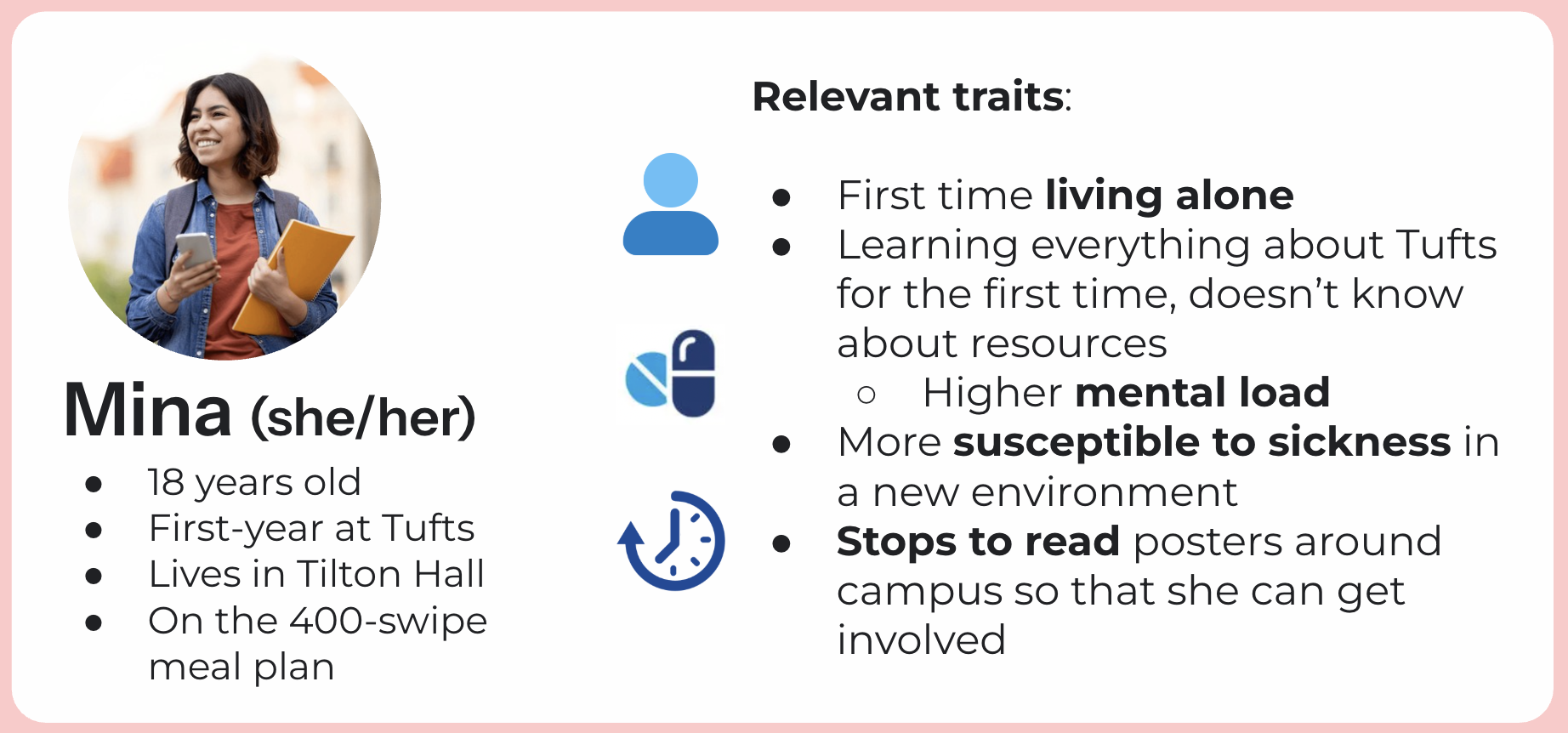
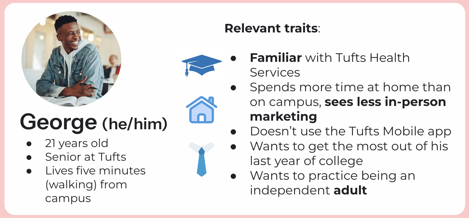
I developed user personae based off of our user research to help us empathize with our user throughout the design process.
After conversation with Dr. J0rdan, we proposed and decided upon four design directions that balanced his needs, our users' needs, and the business' (Tufts) needs.
Canvas notification - capitalize on a low-cost, wide-reaching solution
Email modification - strengthen the most-wanted communication channel
Website flow consolidation - fix the pathway to booking a vaccine appt.
Flyer design / placement - catch eyes in a high-traffic location
⊹ As Dr. Jordan's point of contact, I developed professional communication skills and a deep understanding of our products. As the lead designer, I focused on the website flow, covered below.
Design & Testing
Pre-Design Formative Usability Tests
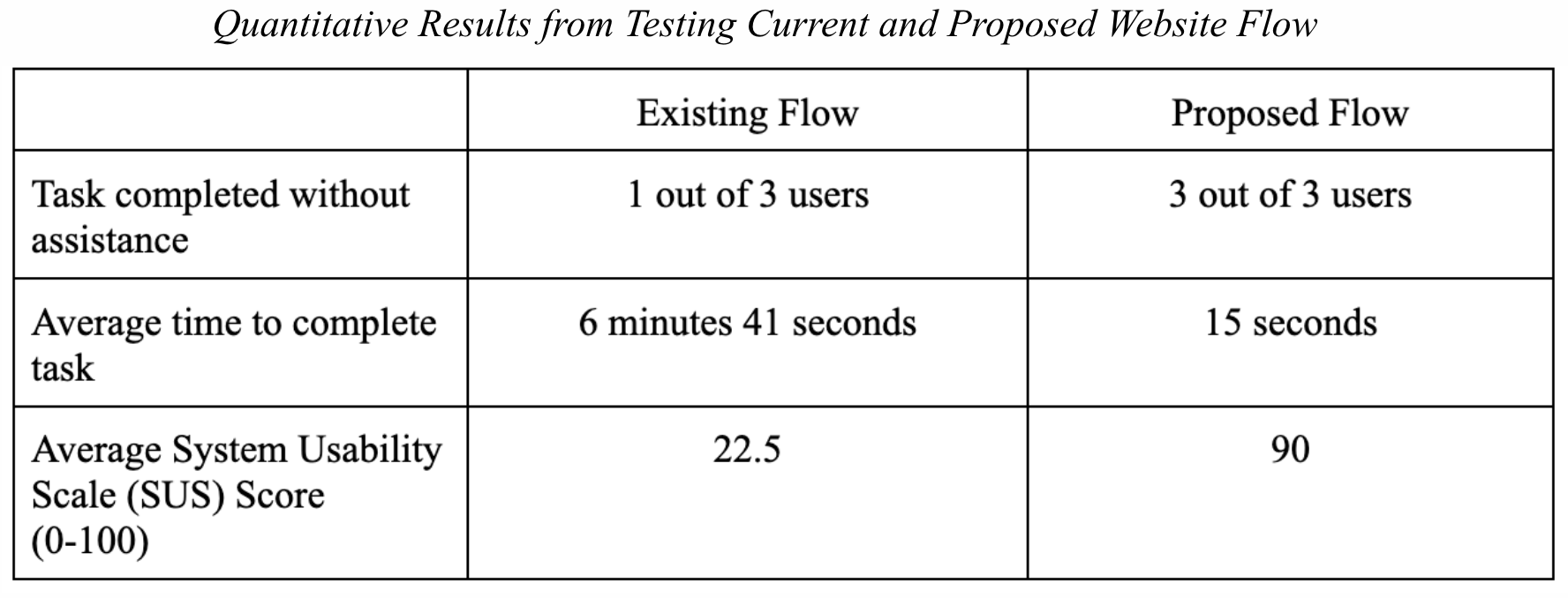
Before I started re-designing the Tufts Health and Wellness website, I conducted three usability tests with students on the original website.
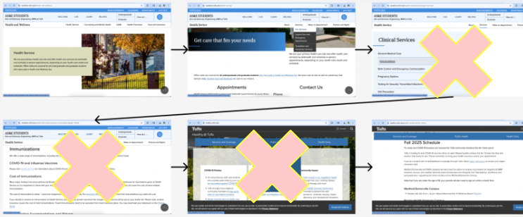
The task: Find the form to book a vaccination appointment.
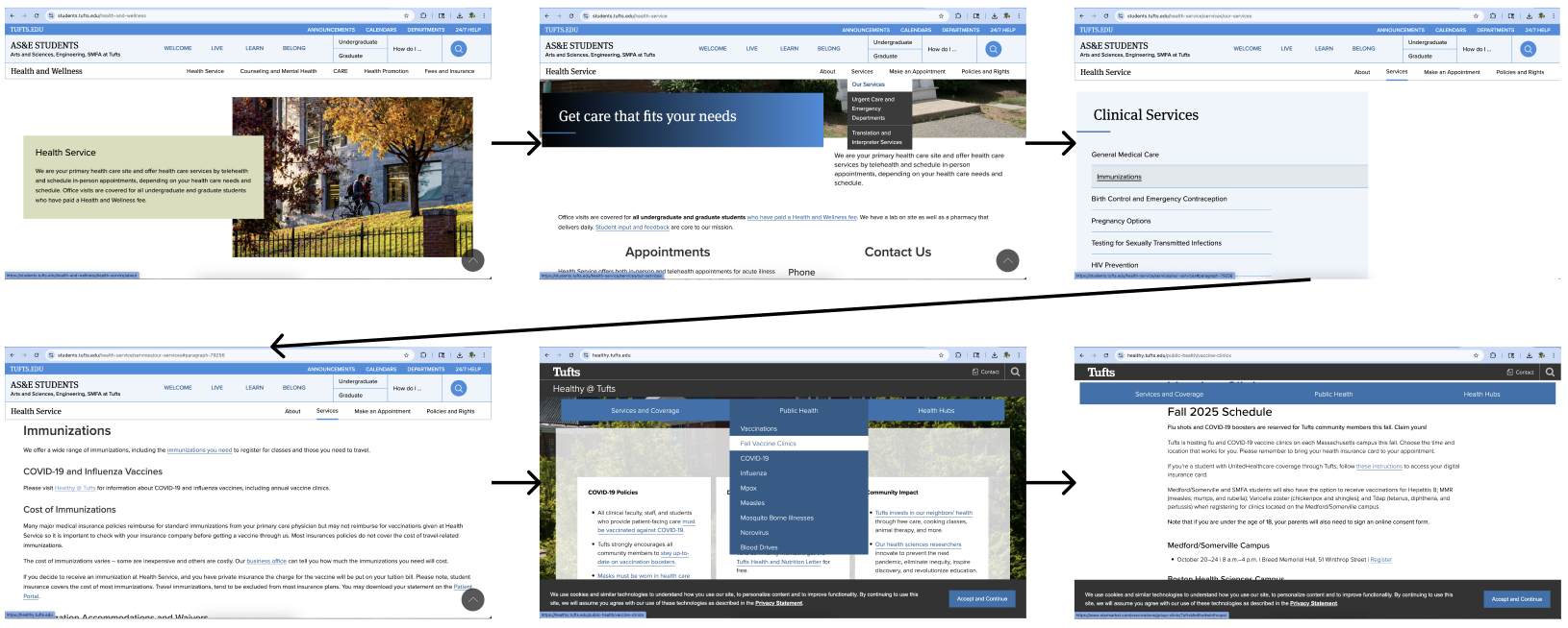
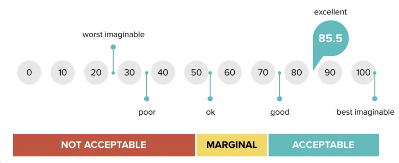
The average System Usability Scale (SUS) score that the three students gave this website flow was 22.5, which falls below the "worst imaginable" range.
Prototyping the Solution
The next step was to fix the flow. My teammate and I used Figma to make an interactive prototype of our research-informed design changes, which include:
A promo banner that appears before the tricky "Make an Appointment" CTA
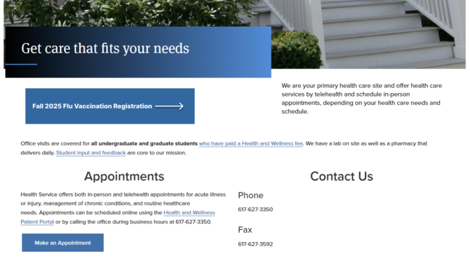
Strategic hyperlink choice to consolidate the flow from 6 steps to 3 steps
⊹ I got our proposed changes approved for brand alignment by Tufts web owners!
Post-Design Summative Usability Tests
My teammate and I conducted three more usability tests on different Tufts students to see if our design changes would improve the usability of the Tufts Health and Wellness flow.
Spoiler alert: They did! The flow is now in the "excellent range" and has been approved for implementation in 2026.
Summary
At the end of the semester, we delivered…
four fleshed-out design improvements to Tufts’ health communication strategy
a report of synthesized research insights into student behavior and engagement with media
recommendations for future explorations into in-person activations and social media
several progress presentations to our classmates, professor, and client
a presentation pitch to Tufts’ Chief Communications Officer and members of the communications team
Results and Reflections
Many of these changes will be implemented next fall for the 2026 vaccination clinic! Personally, I learned so much about user-centered decision making, balancing stakeholder and user needs, and communicating with clients. I am so happy that we were able to fully test the website and receive such positive feedback on our designs!
You made it!
Thanks for joining me on my journey through Point of Care.
Now, let’s get back to Work.